Learn how to make a website design look better in Photoshop with this great step by step Photoshop Tutorial

UBL Designs Blog
HOW TO MAKE A DESIGN LOOK BETTER IN 5 MINUTES
In this step by step Adobe Photoshop Tutorial we will show you have you can make your design just that little bit better in just 5 minutes.
In design the attention to detail really does make the difference as you will see!
Step 1
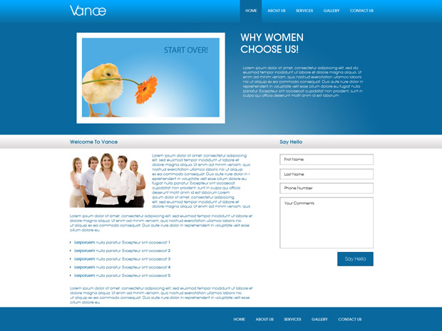
At the end of the tutorial there is a download link where you can get the finished article. This is what the original design looks like at the moment...
First we will start with the navigation background image, at the moment it is very bland with just a gradient.
I grab the line tool and making sure the forground colour is #074d74 i do a line straight away from one end to another, I then start a new layer and i replace the forground colour with #4a90b7 and just under the other line i draw a line straight across again. I now have something that looks like this!
.jpg)
Step 2
Now moving on to the background colour of the hover navigation button
I grab the line tool and making sure the forground colour is #074d74 i do a line straight up 1 side of the nav hover, I then start a new layer and to the other side i do the same. I now have something that looks like this!
.jpg)
Step 3
Making the logo stand out just a little
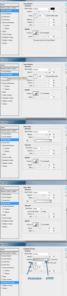
For this all i did is add shadow by double clicking on the logo layer or by going to "Layer/Layer Style/Blending Options". Select the shadow and i made the opacity 47%, distance 0, spread 0 and size 5px.This made my logo stand out just a little.
.jpg)
Step 4
Making the header image stand out
For this all i did is add shadow by double clicking on the image layer or by going to "Layer/Layer Style/Blending Options". Select the shadow and i made the opacity 27%, angle 90, distance 5px, spread 0 and size 5px.This made the image stand out just a little.
.jpg)
Step 5
Adding a button
Within the original design there was just text, i thought lets add to it just a little. I started a new layer and selected the Rounded Rectangle Tool by Pressing the U key and selecting it. Then i made a button shape. I then double clicking on the new layer i just created or you can do this by going to "Layer/Layer Style/Blending Options". Then i did as the image shows below.
Then i added a couple of arrows and the text "More Info". Now you should have something like this
.jpg)
Step 6
Again using the 2 pixal rule we move onto the welcome banner, at the moment it is very bland with just a gradient.
I grab the line tool and making sure the forground colour is #6ba4c5 i do a line straight away from one end to another, I then start a new layer and i replace the forground colour with #033856 and just under the other line i draw a line straight across again. I now have something that looks like this!
.jpg)
Step 7
Again using the 2 pixal rule at the bottom
I grab the line tool and making sure the forground colour is #fffff i do a line straight away from one end to another, I then start a new layer and i replace the forground colour with #838181 and just under the other line i draw a line straight across again. I now have something that looks like this!
.jpg)
Step 8
Again using the 2 pixal rule to make a separating line
I grab the line tool and making sure the forground colour is #fffff i do a line from top to bottom, I then start a new layer and i replace the forground colour with #b0acac and just to the left i do the same again. I now have something that looks like this!
.jpg)
Step 9
A single line goes a long way
I start a new layer and I grab the line tool and making sure the forground colour is #cec7c7 i do a line from top to bottom. I now have something that looks like this!
.jpg)
Step 10
2 pixals within the footer
I start a new layer and I grab the line tool and making sure the forground colour is #064365 and making the line tool 2px i draw a line from right to left. I now have something that looks like this!
.jpg)
Final Step
All of 5 minutes goes a long way
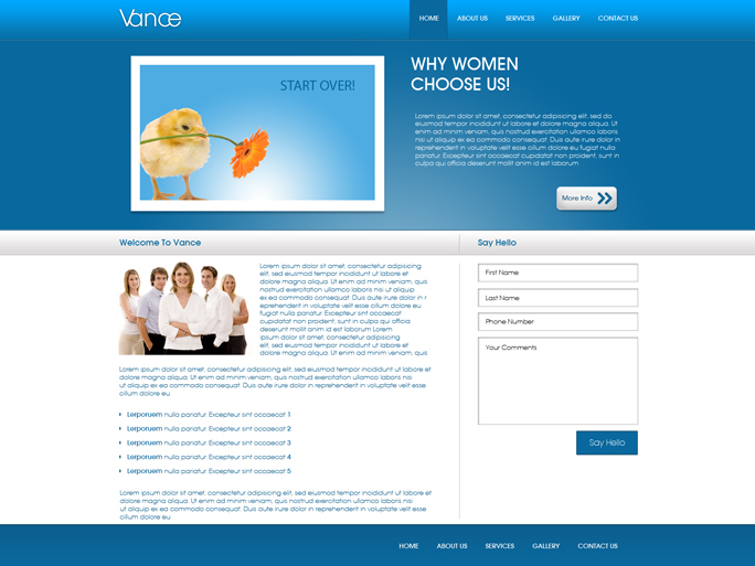
Thanks to just 5 minutes work we have made the design just that little bit more professional!
Comments
Comments are now closed for this post... – UBL Designs
Ana 29 Aug, 2012
The screenshots from Step 5 are too small to see what you did. Please, enlarge them :)